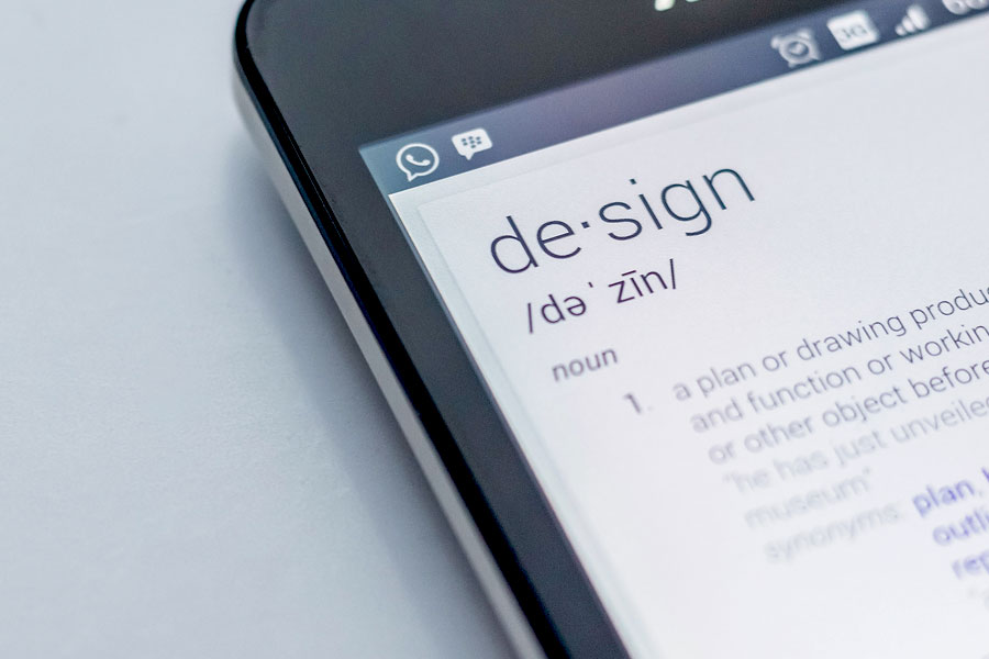
With every design you put on your website, on social media or send to print you are making an impression. Whether you’re reaching new prospects or current clients, you want to make sure you’re not throwing them off or distracting them from your message. How?
Here are our tips for maintaining a cohesive look throughout all of your designs and assets. It all starts with a solid brand.
Full Video Script
Robert: Do you ever look at a design and think… “Something is off, but I can’t quite put my finger on it.”
Well, it’s probably one of these three things. They are the most common design mistakes that I see when updating print or digital designs.
They can ruin your brand impression because people will be distracted by them!
The first mistake is font style or size. If you are using the font as a design element, don’t stray from the font family unless you know what you’re doing. Different fonts will often distract the viewer from your message.
The size of font is important, too. Many different font sizes should have a hierarchy. Otherwise, stick to a general font size for headlines versus body copy. Be consistent with how you use your fonts.
The second mistake I see is color choice. Use your brand colors, but not too many of them in one design. Use your color carefully to highlight important information.
Colors should enhance, not hide your message.
A third common design mistake is a lack of balance. Balance is the weight of elements in your design. It adds stability, structure and emphasis. Proper balance should lead your eye around a design.
Avoid too many elements. The viewer won’t know where to look. Too few elements and the design will look unfinished.
I love designs that bring words and imagery together for harmony and emotion. If you need help with enhancing your marketing and website design, call me.


