CPA Firm Logo and Style Guide

 WhippleWood is a Colorado-based CPA firm whose leadership wanted to improve the firm’s visual look and feel as part of branding research. This would become the foundation to pursue more niche-based marketing opportunities. They did not want a total rebrand, but a branding process that would modernize and refresh their current brand. It’s a great option for firms that don’t need a total visual overhaul, and it optimizes your current brand positioning.
Marketing Strategy

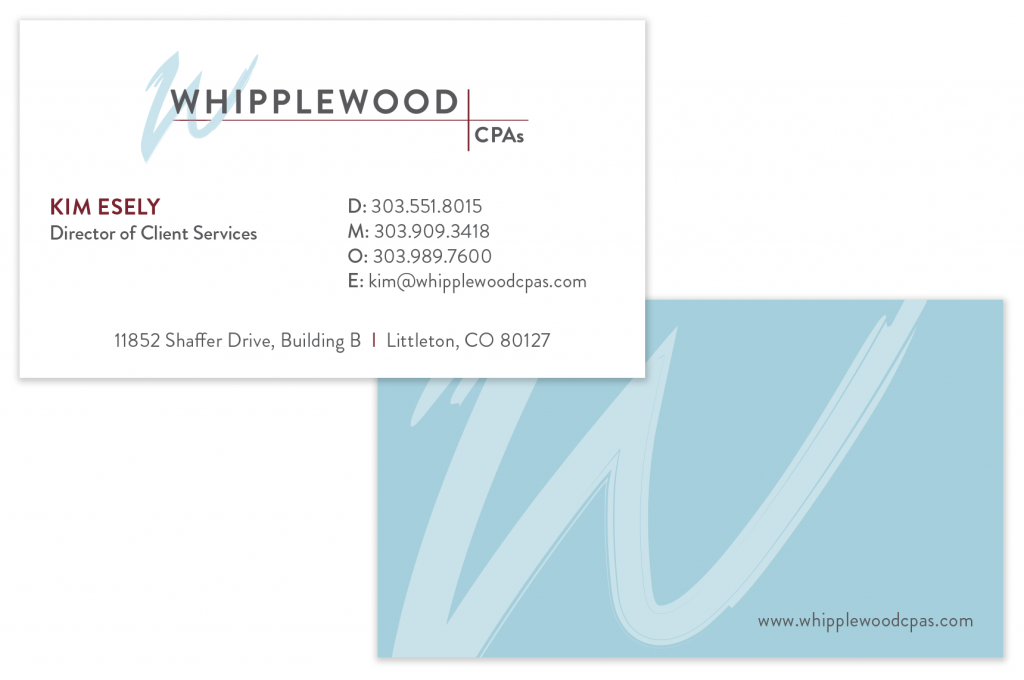
Business card design
Ingenuity worked with the leadership team to explore their differentiating messages as expressed by their best clients. We interviewed leaders and key clients to identify why clients choose them and stay with them for many years. We created branded messaging for the firm to use in its business development conversations and in its website and business materials.
We then focused on design. We refreshed their color scheme with accent colors and lighter primary shades. We identified a more natural, handwritten style for the logo’s “W” glyph, balanced by a san serif font and intersecting lines.
Results

Notepad and income tax return cover
The effect of the refreshed logo is contemporary, but still recognizable as WhippleWood to its loyal clients and referral sources. The formalized color scheme and style guide provides more flexibility in collateral and website design while maintaining consistency in its use. The refreshed visual branding is incorporated into all communications, including their proposal template and social profiles.


