Architectural and Business Photographer

Silverman Be Remarkable creates visual narratives of people, places and spaces, specializing in architectural photography and In Your Space™ corporate lifestyle and business portraits. Owner Steve Silverman serves clients in commercial photography through the Midwest, United States, Canada and western Europe.

Ingenuity originally worked with Silverman on a full branding process that resulted in the tagline, Be Remarkable. In addition to designing a new visual brand, logo and style kit, we conducted client interviews to help Steve Silverman create a new go-to-market strategy that resonated with his business vision. With his new brand and strategy, Steve Silverman transformed and grew his business exponentially.

Be Remarkable

Architectural and Business Photographer

Silverman Be Remarkable creates visual narratives of people, places and spaces, specializing in architectural photography and In Your Space™ corporate lifestyle and business portraits. Owner Steve Silverman serves clients in commercial photography through the Midwest, United States, Canada and western Europe.

Ingenuity originally worked with Silverman on a full branding process that resulted in the tagline, Be Remarkable. In addition to designing a new visual brand, logo and style kit, we conducted client interviews to help Steve Silverman create a new go-to-market strategy that resonated with his business vision. With his new brand and strategy, Steve Silverman transformed and grew his business exponentially.

Marketing Strategy

We worked with Silverman on the original brand six years prior, and Steve was ready to refresh his company logo.

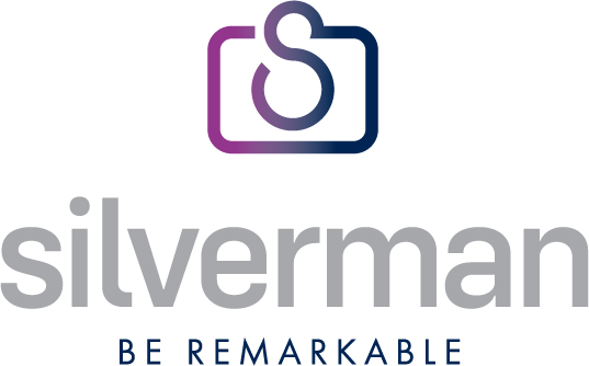
He trusted Ingenuity to take his existing logo and refine it. He still loved the symbolic camera glyph that incorporated his “S” initial, but he wanted the entire logo to feel more dimensional.

We thought it was time to try a new font and perhaps a lowercase style, balancing the name’s font size and style with the scale of the glyph.

Steve also wanted to keep the tagline as part of the logo presentation, which lent itself to a stacked design for balance and clarity.

Silverman logo

Results

Because Steve is well-known for his skill and technology to capture natural light in photographic narratives, we chose a color gradation on the refreshed glyph. The vibrant color is eye catching, and it communicates the remarkable effect of light and shadow. We used one is Steve’s dress shirts as inspiration for the color palette.

We lifted the “S” to the top of the glyph to more fully render the camera image and reinforce it.

The Silverman name is now in a lowercase style, but it is still bold and memorable with its tagline.

The final logo refresh is highly recognizable to clients and industry partners with a modern vibe for the future.

SEE OUR BRANDING SERVICES

“Ingenuity led me through the repositioning of my brand several years ago, helping me to transform my photography business to the next level. I recently went back to them to refresh my logo. I trust their approach. The result is that my marketing assets continue to look new and cutting edge."

– Steve Silverman