The Wood Component Manufacturers Association (WCMA) promotes the interests of the North American wood products industry through interactive and innovative manufacturing solutions. Although these solutions have become increasingly modern, association leaders and board members noted a brand perception and logo that felt outdated and mismatched with their more youthful members.
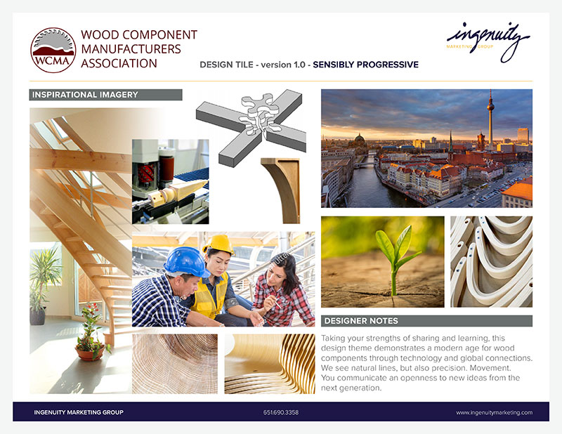
WCMA worked with Ingenuity to identify words, images and member benefits that set their North American members apart. They also wanted a logo that would translate well to European partners, since they host plant tours overseas.
Looking for a modern aesthetic that departed from the “saw blade” imagery of the former logo, Ingenuity’s design and communications team explored wood component images and abstract shapes to develop a logo that represents expansive and vertical growth. Playing off of a modern staircase with warm tones, the glyph embraces the association’s name and frees it from convention.


